Reflections
sharing random thoughts about my current interests and tools I’m learning
“Write what should not be forgotten” (Isabel Allende)
3-2-1 approach to better charts
Four days ago, I listened to a presentation by Alberto Cairo. It was one of those things I had put on my calendar weeks ago with a generic title but with a side note saying, “Attend this meeting.” It was like my past self knew what my future self needed to listen to. The presentation was beyond inspiring. It was so simple, so natural, so complex, but so honest that it moved me in a way that is hard to explain.
So here I am. Committed to improving my skills in visualizing data.
Right after the presentation, I subscribed to a couple of newsletters as a starting point. I’m still trying to figure out what this commitment will look like and what being committed means. In the meantime, I want to accomplish two things:
- Allocate time in my week to this topic
- Document the process.
Monday morning routine. Check emails and clear inbox. And there it was, the email that triggered this post. At 6 am PT this morning, Stephanie Evergreen newsletter was sent out. It is 9 am, and I’ll dice into it as my first (baby) step into my commitment.
The newsletter took me to Stephanie’s YouTube Channel. Why Stephanie? I’m not sure. It was the first thing that popped into my inbox, so I want to explore more.
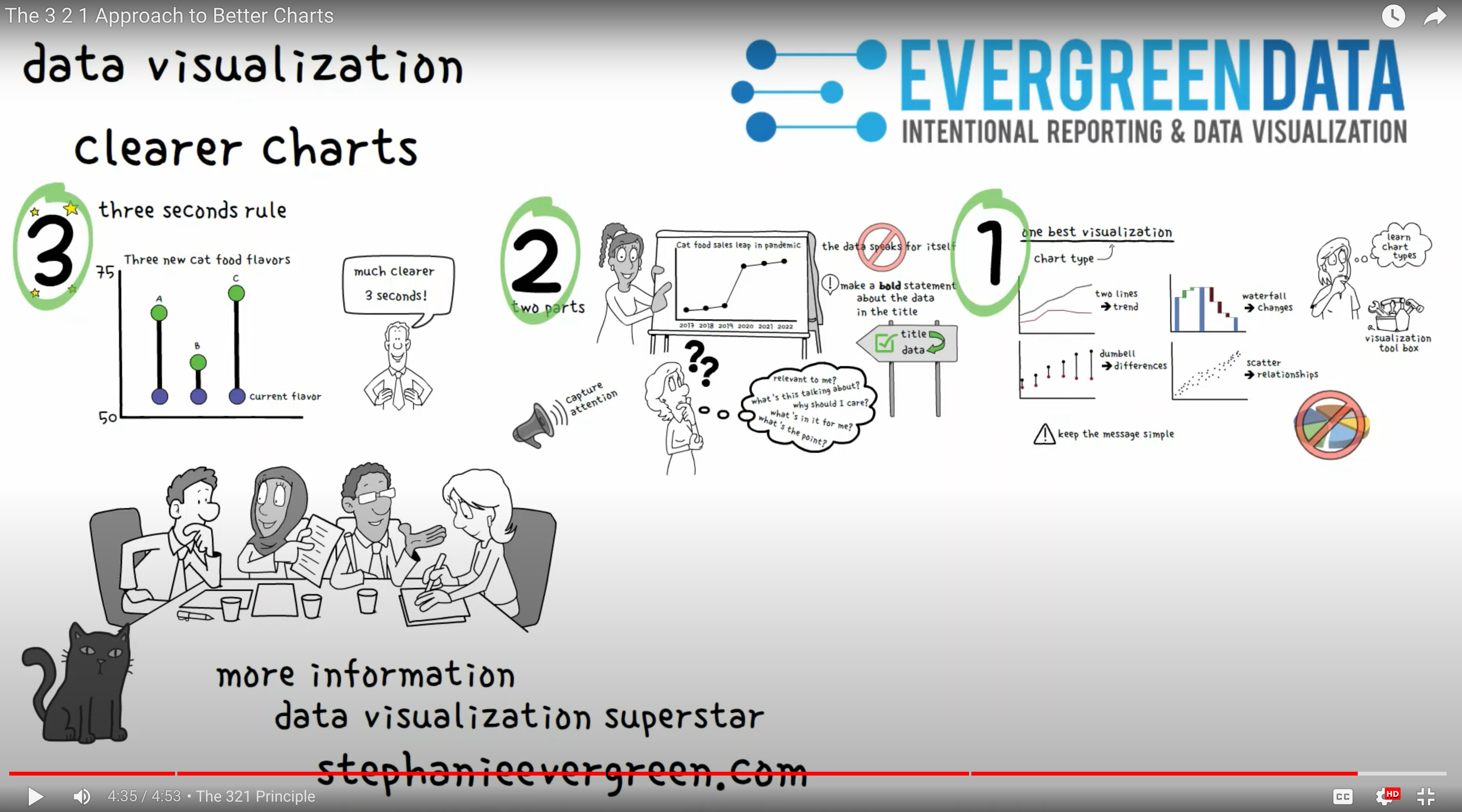
I watched a 5-minute video titled “3 2 1 Approach to Better Charts”. Take always:
You have 3 seconds to capture your audience’s attention. Your plot should ONLY focus on what is important. E.g., the difference between two products.
Chart have 2 components the Title and the Data. Use the title to guide the data insight you are trying to show. Data DOES NOT speak for itself, so use words effectively!
There is always 1 best way to plot your data. The type of plot matters. Each type of chart has different objectives. Examples presented on the video: Two line graph are good for showing trends, waterfall chart is helpful to show change, dumbbell charts present differences, scatterplots are great for showing relationships.
Stephanie offers a program called The Data Visualization Academy. An online platform with videos to cruise at your own pace and learn all data vis things. I’m considering paying (investing) for a course as a way of solidifying my commitment to learning this skill. But I’m still unsure if that is the route I want to go or not and what course I’d pay for. The Academy look very rich in content, so might consider signing up. We’ll see.
With this, I feel accomplished for today. More soon!
Bespoke
A year ago, I was on the market for buying a fridge. In my search, I found a model called the “bespoke.” Not being a native speaker, sometimes, some things get lost in translation. The Bespoke fridge was colorful and the colors were customizable. Not within budget and not my style of fridge anyway. Months later, I’m watching Cara Thompson’s talk on “Building a Dataviz Design System for a Medical Research Project,” and bespoke showed up again. Then I’m reading other data viz stuff, and there it is: “bespoke visualizations.” Mmmm.. there is more to this word than just a fridge model. Bespoke as in data visualization, according to Google “the process of combining data into innovative visualizations to gain new insights”. Sooo, my next logical question (finally): What does bespoke mean? “Specially made for a particular person, organization or purpose” (Cambridge Dictionary). Not only learning data visualization but English! Bespoke: word of the day!
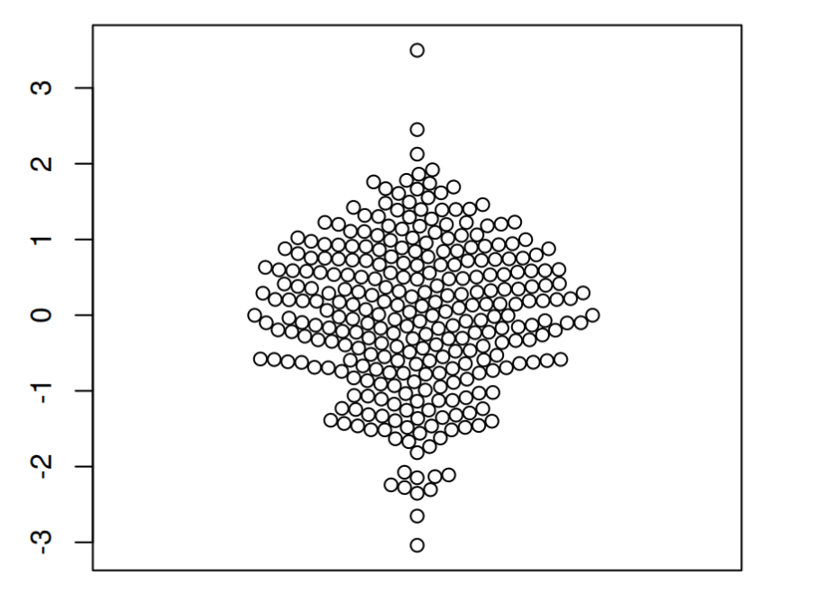
More on bees. Beeswarm plots. Is this a coincidence? Probably. I think Bespoke and Beeswarm are not related in the English language. But, as a none native speaker, my first inclination is to judge by the sound. Be Be, it all sounds like Bee to me. Anyways, Beeswarm plots are a thing: “Bee swarm plots are similar to strip charts and are designed to show the underlying distribution of the data but unlike strip charts, the data is arranged in a way that avoids overlapping” (R Charts) This is what a beeswarm plot looks like in the simplest of its forms.

Does this come from a Bee Swarm?? Probably. More data viz and more English for me. Note to self: The Spanish translation of bee swarm is “enjambre de abejas”
Ps. There is lots of information about plots on the R charts site. Here is the section for my beloved ggplot2. And information about colors in R .
Tip on charts font size
Another email from Stephanie. And I think, why not document this information in my Reflections journal. What I like about this exercise of writing about what I read is that it will help me remember. So here is the deal on font sizes and graphs:
- The graph’s final destination (presentation, report, dashboard, etc.) will determine the font size choice.
- You may have two versions of your chart, one for a close-up audience and one for a large room.
Be mindful of the setting in which you are going to present your chart. “The smallest font size you can get away with in large room reading circumstances is 20 points.”
Thank you Stephanie!